Basic information about the Comenia Script® font and its characteristics
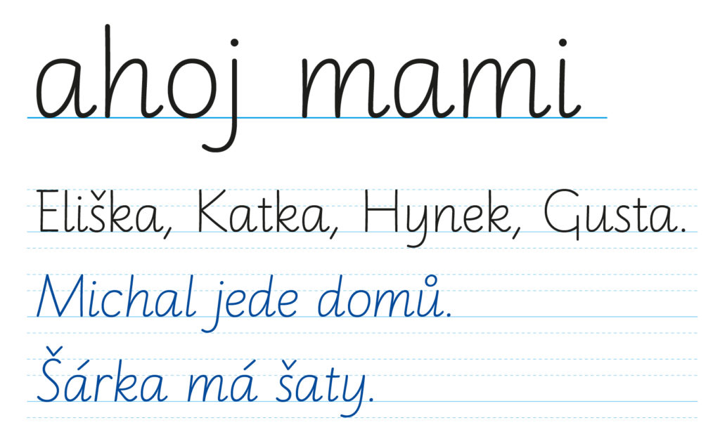
Comenia Script® is a practical handwriting model for children that is simple, modern and contemporary. The goal of the Comenia Script® project is the joy of writing and seamless, readable communication in the Latin alphabet at the international level.
The Comenia Script® model takes into account the writing needs of dysgraphics along with left-handers. Various teaching materials and instructional applications of writing are provided for writing practice, and are part of a comprehensive teaching system. The author of the Comenia Script® font and of its accompanying teaching materials is MgA. Radana Lencová, Ph.D.
Research trials by the Ministry of Education, Youth and Sports of the Czech Republic
In 2010–2012, the Comenia Script® model was pilot-tested by the Czech Republic’s Ministry of Education at 33 primary schools throughout the Czech Republic. The results of the pilot project can be found in the section “Let’s try” > Download
Characteristics and advantages of the Comenia Script® writting model
- A simple capital alphabet, in contrast to the complex Baroque strokes of the current school standard which we hardly use in practical life.
- The writing model has an optional slope. Children are introduced to slope only when they reach the 2nd grade.
- Connecting letters is also optional; letters don’t have to connect at all. This eliminates illegibility in a writing style, which arises from (among other things) an uninterrupted writing stroke which forbids lifting the pen within words. Connecting letters by simply having then closely approach and touch each other, which allows lifting the pen, is also practical for writing diacritical marks – children will write them immediately above the letter: not after writing the whole word, as in cursive writing styles that are based on ceaseless joining.
- The writing model meets the current needs of children, who are already abandoning the ceaselessly joined style of cursive handwriting even before they reach puberty. This also applies to children at the 1st stage of primary school.
- Simpler writing may be easier for people in other countries to read; conversely, foreigners coming to the Czech Republic will better understand our handwriting, and communication will be easier for them.
- By making the handwritten letterforms closer to the print font, reading and writing are simplified. Children do not have to learn four sets of letterforms, but only one or two.
- A simpler handwriting style helps in better understanding the text, as opposed to a more complex style that can distract from the content.
- Comenia Script® has specific sets of strokes for both right-handers and left-handers, which the principle of the existing current school standard handwriting style does not allow.
- Several letters and numbers in the alphabet have additional shape variants. This allows the child to choose which shapes he or she prefers. Children are introduced to shape variants only when they reach the 2nd grade (7 to 8 years).
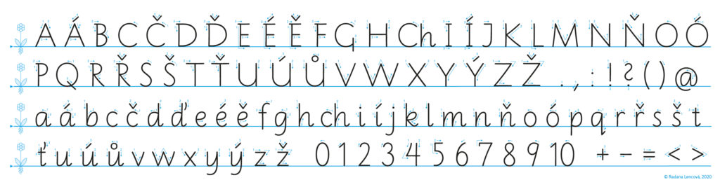
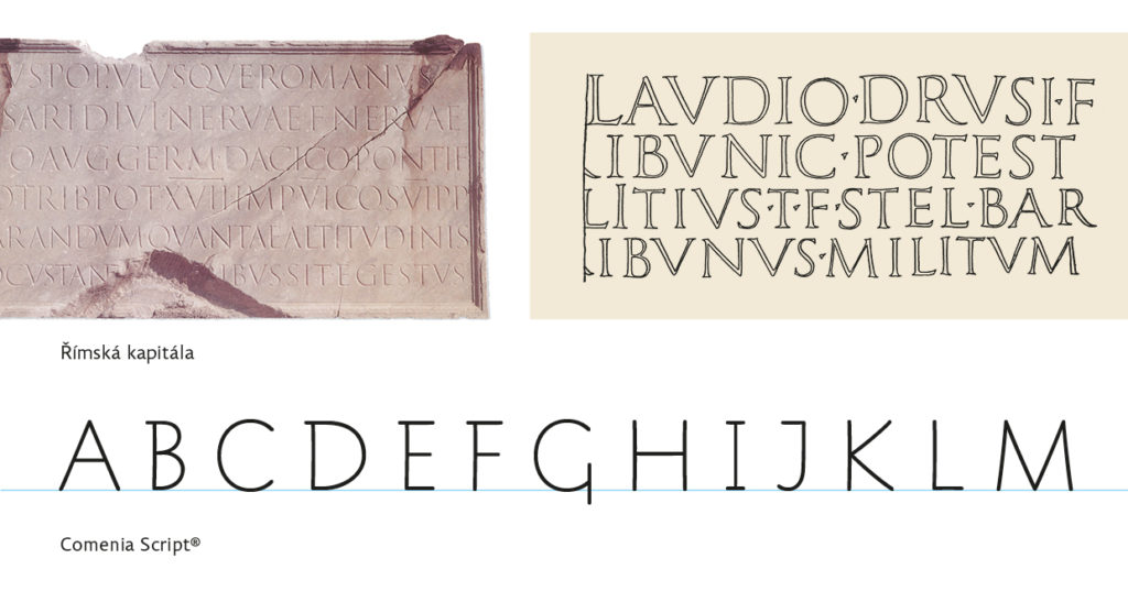
Uppercase alphabet
The shape of the alphabet is based mainly on Renaissance Italian models, but the alphabet’s appearance is more reminiscent of printed italic typefonts. For the uppercase alphabet, an example from the Renaissance was chosen, allowing a harmonious combination of uppercase and lowercase alphabets into a perfectly readable and practical whole. In order to maintain the accuracy of the geometric proportions, the shapes of the capital alphabet are based directly on the shapes of the Roman capital and not on its Renaissance modifications. Most horizontal strokes begin with subtle left drag (B, D, E, F, P, R) that occur with a normal letter-production rhythm. As you form the letters faster, they can become even more pronounced, giving the letter a distinctive expression.
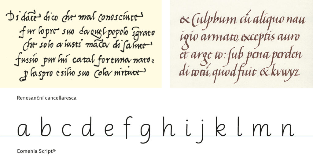
Lowercase alphabet
It is not directly a Renaissance model, but is inspired by the basic skeleton of the lowercase alphabet and also by the Renaissance writing process, which is characterized by stems without loops and by placing letters closely together (instead of connecting them). The basic stroke-sequence of the lowercase alphabet is conceived in a more open form, which is easier to read, and which at the same time allows each child to select his or her own individually preferred width of letterform.
Comenia Script® universal
The typeface, which was determined by the Decree of the Ministry of Education, Youth and Sports of the Czech Republic for research trials in the period 2010–2012, is the Comenia Script® universal writing font. This font was thoroughly tested, then modified based on experiences during the research trials. The font was chosen and designed to be made available to the widest possible range of children (including special schools) who participated in the verification. The “universal” typeface has simple free stems and exit-strokes for connections. More information on Comenia Script® universal handwriting practice and handwriting instruction can be found in “The Comenia Script® universal Practical Manual“.